Bullet points are a great way to present related pieces of information. They are well understood and relate to the main concept well. Bullet points are a concise and organized way of making your points. Bullet points help you emphasize the individual points.
However, bullet points are basically textual content. While they are good for avid readers and books, they appeal very little to visual audiences. They make presentations look dull.
Visual presentation plays a key role in attracting the attention of the audience. It also helps in the retention of information. What do you do when your content demands a bullet-point presentation?
How do you make your presentation visually appealing?
Well, the task is a little tricky. Here, we will discuss a few approaches to replace bullet points with more visual presentation techniques.
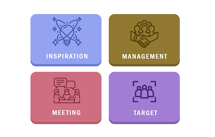
- Using a grid layout: Using a grid layout is perhaps the simplest but an effective way to present lists with short texts. It helps avoid the visual monotony of a textual list. Each bullet point is placed in a suitable shape. The shapes can have the same colour, shades of a colour, or different colour altogether. It is important to space out the shapes evenly so that the area looks balanced. For better effect, the shapes can be animated. Shown below is an example of a grid layout.

- Interactive Headings: Interactive headings are a great way to reduce on-screen text upfront. At the same time, it increases user interactivity. Here, each bullet is replaced with an icon and a heading, with no other text. Users can click/hover the headings to read the texts. This strategy is very helpful when the bullet points contain larger text. Interactivities can also be in various forms such as simple pop-up text, animated pop-ups, flashcards, etc. There is no limit. Shown below is an example of an interactive heading.

- Using infographics: Infographics are one of the most creative ways to represent pointer-type content. If you have content like 6 ways of great bodybuilding, 5 ways of better storytelling, 7 ways to start your day on a positive note, etc. infographics can be your go-to strategy. Infographics utilize a combination of text and images or icons that are interconnected and are a visual treat. The audience will surely love well-designed infographics. Infographics are best suited for delivering a message that has connected pointers. That’s why they are called infographics as they deliver information in the form of graphics. Shown below is an example of infographics.

- Adding icons: Adding icons instead of bullets is a creative way to replace bullets with a creative presentation. Icons represent the central idea of the bullet points. While replacing the bullets, icons also increase the attention of the audience and help them comprehend the content better. Icons give the audience a quick glimpse of the central idea which is then expanded by the supporting text. Icons can also be used as identifiers in case you want to refer the content back. This is called visual coding. It keeps the learner engaged and is a great tool for the retention of information. Shown below is an example of icon base representation.

- Highlighted Headings: If you can have a heading for each of the bullet points, this strategy can be very useful. Here the heading is given a separate style from the text. If the space permits, then icons can also be added to enhance the visual appeal. It is important to make a clear distinction between the heading and the text. All heading should follow a similar styling and all text should follow a similar styling. If images are used, they should gel well with the placement of text and heading. Shown below is an example of highlighted heading.

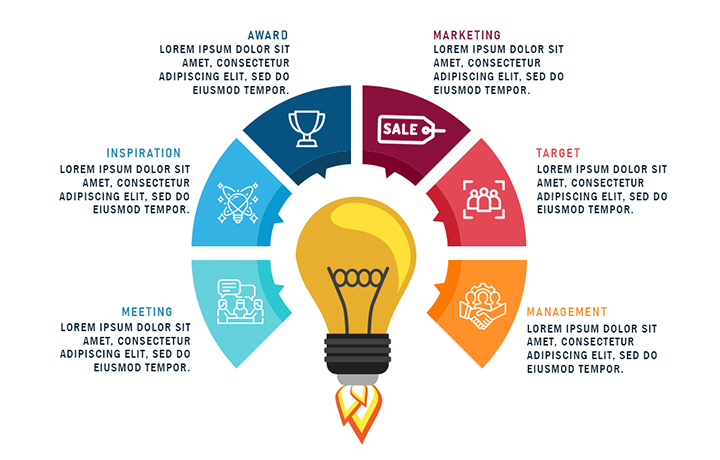
- Using integrated image: Most bullet points are built around a central idea. The central idea binds the bullets together. This can be utilized to create an appealing central theme image from which the bullet points can emerge. This is also helpful in depicting the connection of the bullet points with the central idea. Shown below is an example of an integrated image strategy.

There is no fixed rule of how you can avoid using a plain bullet list. You can go as creative as you can imagine. The key point is to choose a strategy that best suits your content and the connection you make with your audience. In the end, it is audience connection that matters most for content to be effective.
