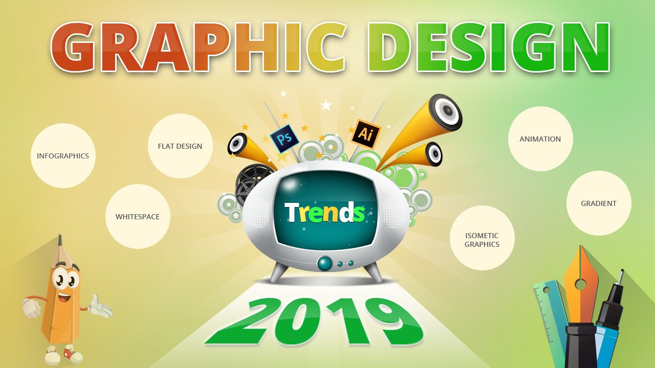
Graphic Design Trends in E-Learning Industry
Someone truly said that Pictures speak louder than words. The best use of pictures we can imagine is done in education. Right from the days of kindergarten, recognizing a tree by its picture to the days of high-school solving geometrical algorithms picture or graphics play a huge role in the learning process. In more advanced scenario like E-Learning we make use of the term graphics. When 10 words cannot convey something to a learner, a graphical representation of the fact or an interactive graphical approach would make the whole process so easier.
Basically, in E-Learning, graphic design improves the understanding and grasping capacity of the learner. Also, graphics break down a lesson structure which evades the monotony and evokes the interest in learning to a great extent. Monotonous learning is worse and is not fruitful.
In this post we will take a look at the existing graphic design trends in the E-Learning industry and the. We will have a brief discussion on how these trends can be utilized by top E-Learning companies in India to increase their tool’s productivity.
Various Graphics Design Trends in E-Learning Industry
There are various graphic design trends followed all around. We will discuss them briefly one-by-one.
White Space
Also known as negative space design, it is that untouched portion in a web page, the space between graphics, text etc. In most cases it’s white but that’s not mandatory. It maybe colored as well. It enables a sense of simplicity. In E-Learning it helps to maintain the stable flow of learning process. This flow will help in building focus.

It also showcases the efficiency and understanding of the designer. One may be an ace web designer for the best graphic design company in India, but the material you are designing will be used by a learner who is a total newbie. Here is where simplicity and focus in understanding will matter. It should not be overdone but is should be done as such which maintains the ambience of the page and also fulfils the purpose of E-Learning.
A simple example of use of white space in graphic design is homepage of Google or Answer box on the Quora website. It is simple yet efficient.
Text over Image
Though graphical representation is important, it should have a textual representation in equal proportion as well. The colour of the image and the colour of the text/sentence/phrase should balance with each other. Too much brightening or darkening the will affect the whole learning material as well as the learner. Th placement of the text also matters a lot. You cannot simply put a phrase over an image. In pretext of graphical representation, we cannot have a learner miss out on the textual or written parts of a E-Learning material.

Designers should look for that vantage point on the page which will convey both the text and picture to the learner. Instead of overlapping the text on image, the designer should place it in an overlooking manner, where it incorporates a balancing visibility. Here sizing also matters. The size of image and text should go should have a subtle balance.
Last but not the least the choice of image is quite important as well. We all know images invoke emotions and expressions. In the E-Learning material whatever emotions or thoughts an image may represent, the corresponding text should express it out. It should not be too noisy but simply to the point and conceivable.
Gradient Overlays
Gradient overlays are very similar to colour overlays, but this technique uses gradients typically from one side of the colour spectrum to another. Not only does the gradient overlay give the photo a refreshing look, but it can also set the mood based on the chosen colours. Depending on the level of transparency, this type of filter will make the photo less prominent, allowing the text to be clearly legible.
 Using of Stock Images
Though modern computer graphics has taken the graphical representation to a higher level, still best E-Learning companies in India make use of stock images. These image are not created artificially and comprise of live people and locations. This induces a sense of reality when the E-Learning process is actually virtual. These have no copyright issues and an E-Learning company can use it by licensing and paying a small royalty to the original creator of the image.

These images can further be used by almost anyone and everyone obviously iven that that contexts of its use are not similar.
Flat Info graphics
This is usually used in mathematical and statistical E-Learning tools. It makes use of various kinds of charts to present data and information. We can consider the multiple data chart as an example. Again Map marker and Map animations also come under flat infographics. It mainly follows expressive design architecture. They generally occupy less space and present the data in a single chart or animation.
So, that’s about it. Graphics is an inseparable entity when it comes to E-Learning. All these factors we overlooked are equally responsible in providing a stable, efficient and interactive E-Learning course material. These are some of the important graphic design trends that E-Learning companies in India should follow while churning out their e-learning materials. Also, if you’re an e-learner then what factor of graphics in an E-Learning tool exactly interests you..? Do share your views with us.
Custom Illustrations
This is an absolute no brainer that being able to customize your own designs always gives you an upper hand when you are trying to sell your product. Having its own design in the course materials actually makes an E-Learning company stand out from the rest. It brings in uniqueness in the visual aspects while keeping the approach simpler and straight forward.
Modern Retro Design
It bridges together the old designing practices with the modern trends of visualization. A good example of the same can be pixelated illustrations, linear interface elements and slower-yet-funny animations. Also, there can be use of basic geometrical shapes. In terms of colour, neon and yellow are mostly used.
Animations
The E-Learning companies can make use of animations, GIF images which further simplifies the learning process.

If the course material is targeting the small children, then animations will work wonders. It will in fact invoke creativity among the learner. The learning process should have brief storytelling, animated examples which will make the course material for interesting.
Video
This is one of the most basic requirements of E-Learning. The top E-Learning companies who incorporate the best graphic design trends should first and foremost make use of videos. Designers should create the video player plug-ins that will showcase the learning content in a interactive manner. It should not be repetitive though.
A best example of this can be, when a new learner takes up an E-Learning course, there should be small video which will give him a brief overview of his course details like duration, modules, exam structure, fee structure etc.
3D Graphics
This is not some new topic in graphic design. 3D graphics has been used by best graphic design of India and everywhere else. Even when we look at E-Learning domain, some of the top E-Learning providers in India actively make use of the 3D graphics.

Usually the use of 3D graphics is mostly done when designing a course material for subjects such as Mathematics, Geometry, Civil engineering, Statistics etc. IT helps in breaking down the algorithms, complex calculations and incorporates an ease of understanding.
Related Articles
View All
Why Visual Design Is Critical In eLearning?
Thanks for sharing this valuable information.